Signeasy Brand Refresh
A Brand Built with Care, Evolving with Purpose

00
Overview
Signeasy is a contract management platform that streamlines the contract lifecycle from preparation and collaboration to signing and management. As the company evolved from eSignature tool to a comprehensive contract management solution, the brand needed to reflect this growth.
Challenge
As the product grew, the brand faced several challenges: it felt outdated and didn’t fully show our easygoing approach to innovation and strong customer care. We needed to refresh the brand without losing the signature blue, appeal to a growing customer base, and create a consistent, scalable design system across all customer touchpoints.
Brand Strategy & Identity
At the heart of the refresh was a strategic decision to express two defining brand qualities:
Creators: curious, innovative, constantly refining the product for simplicity and speed.
Caregivers: empathetic, supportive, human‑centered — making contract management feel effortless.

To drive this visual language, I collaborated closely with Signeasy’s leadership, marketing, and design teams to understand how the company wanted to show up in the world. These insights guided every creative decision, ensuring the brand reflected its dual identity across all touchpoints.
Design Evolution
We focused on appearing “trusted yet fresh”. We aimed to blend reliability with innovation since customers depend on Signeasy for secure, dependable service while enjoying a modern, engaging experience. This positioning became the foundation for the refreshed visual identity
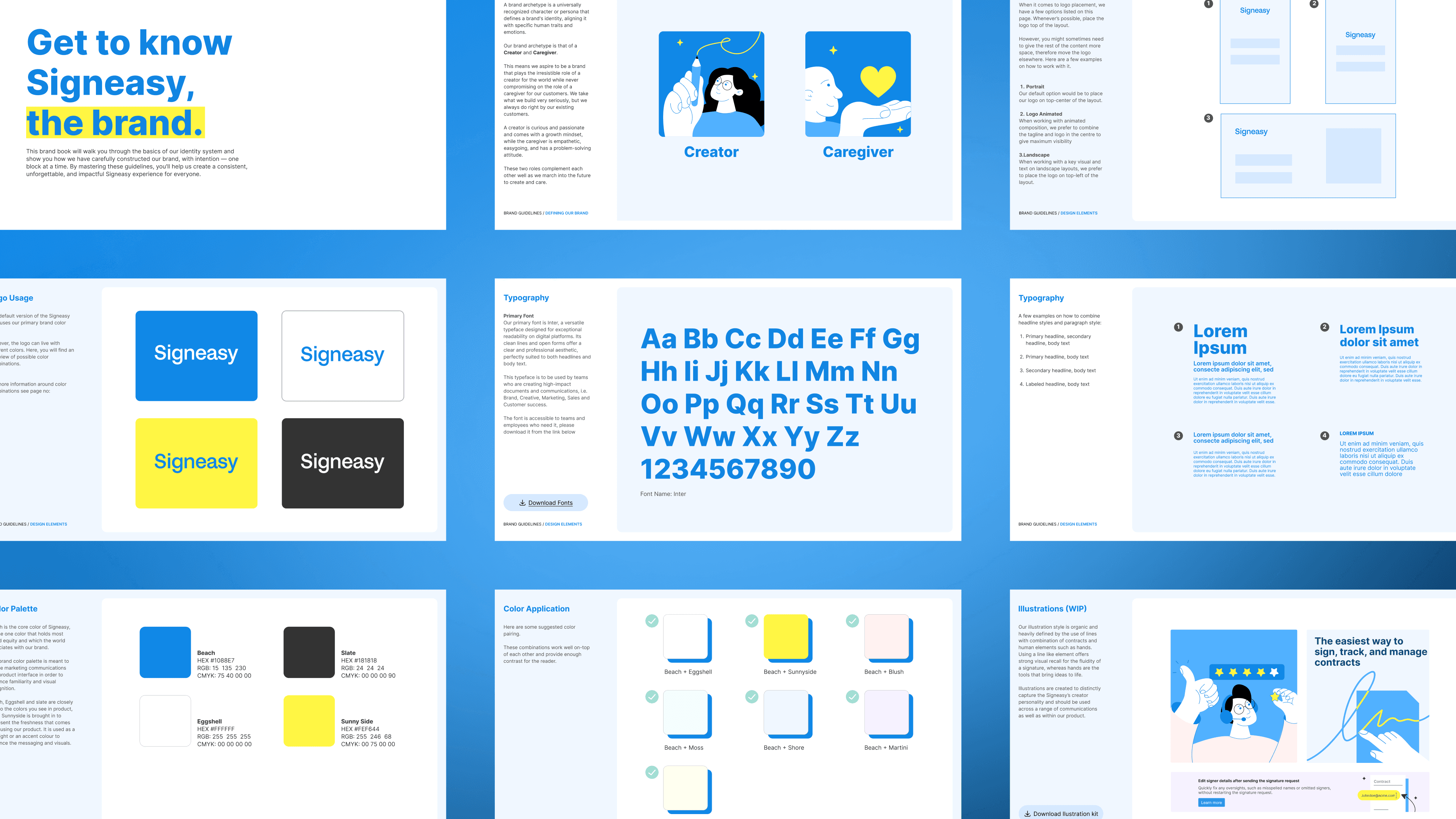
Colour
We created a balanced palette that enhances clarity and consistency. Our signature blue remains the foundation, while yellow serves as the perfect highlight color—adding warmth, optimism, and vibrancy without visual overload.
Illustrations
Custom line-based illustrations evoke the fluidity of a signature, with subtle pops of color for vibrancy. These illustrations capture Signeasy’s creator personality and are designed for use across communications and within the product.
Images
Beyond color and illustration, we refined our imagery to radiate warmth and confidence, reflecting the brand’s caregiver side. Across product visuals, web, and marketing, we show people in effortless, inviting moments evoking ease, positivity, and a sense of empowerment and support.
Impact
The Brand refresh positioned Signeasy as mid-market ready, establishing it as a contract management platform built for the future. A cohesive design system brought consistency across product, web, and marketing touchpoints. This was supported by a comprehensive brand book, creating a scalable foundation for continued growth


see also


