Signeasy Homepage
UX-Driven Approach to Improving Conversion Rates

00
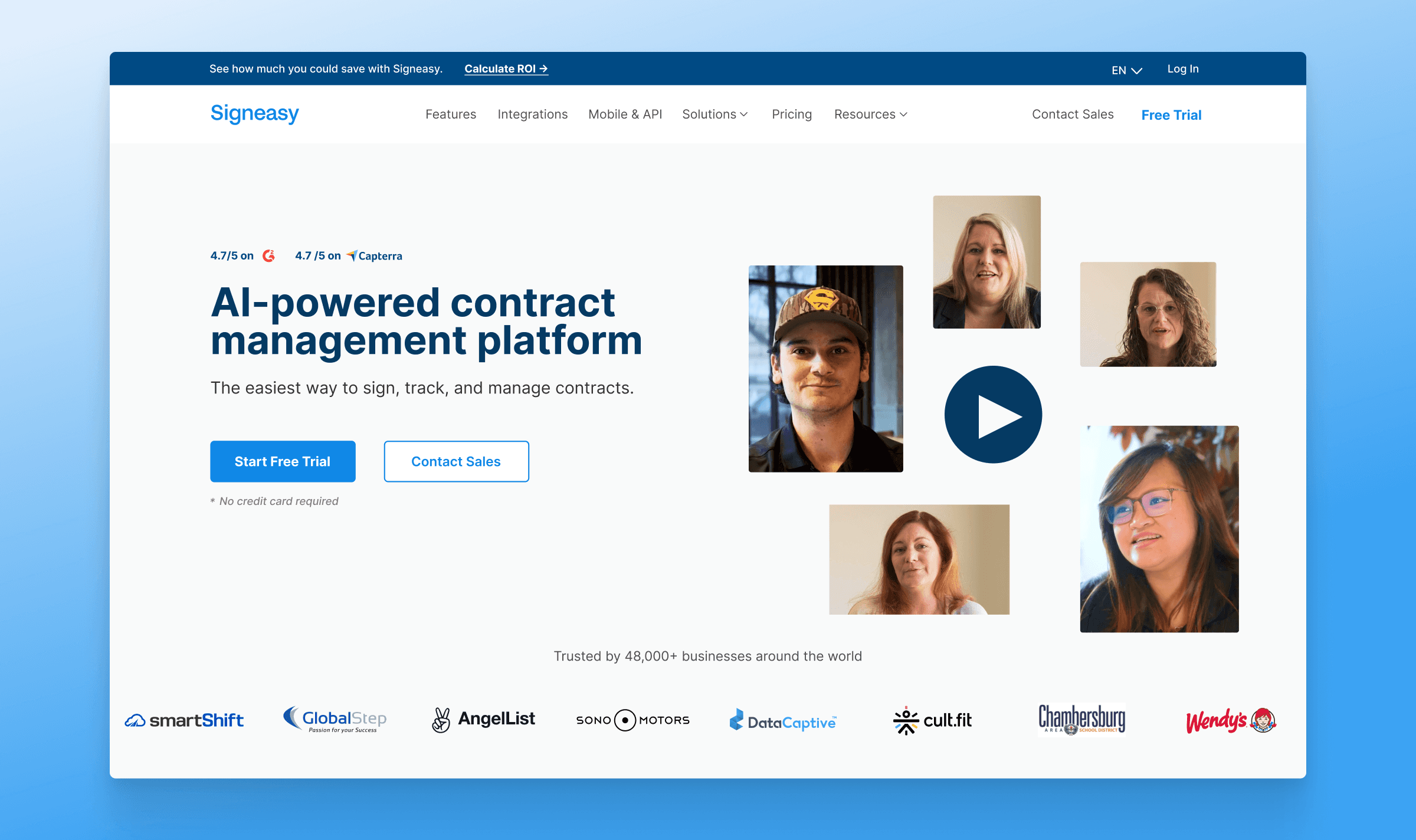
Overview
The Signeasy homepage was redesigned to improve click-through rates and overall user engagement. The update focused on creating a clearer user experience, stronger messaging, and visible social proof to build trust and drive conversions.
Challenge
The previous homepage did not clearly explain our value or build trust, causing users to drop off after just two to three scrolls. Poor page flow made it hard for visitors to understand what to do next, reducing engagement and conversions.
Goals
The goal of this project was to drive engagement through conversion-focused design. This included improving the UI/UX with cleaner navigation, adding trust signals like G2 badges, Capterra ratings, and customer stories in the first fold, and updating the messaging to reflect Signeasy’s current positioning. Key content was brought forward to reduce scroll depth and guide users more clearly toward conversion.
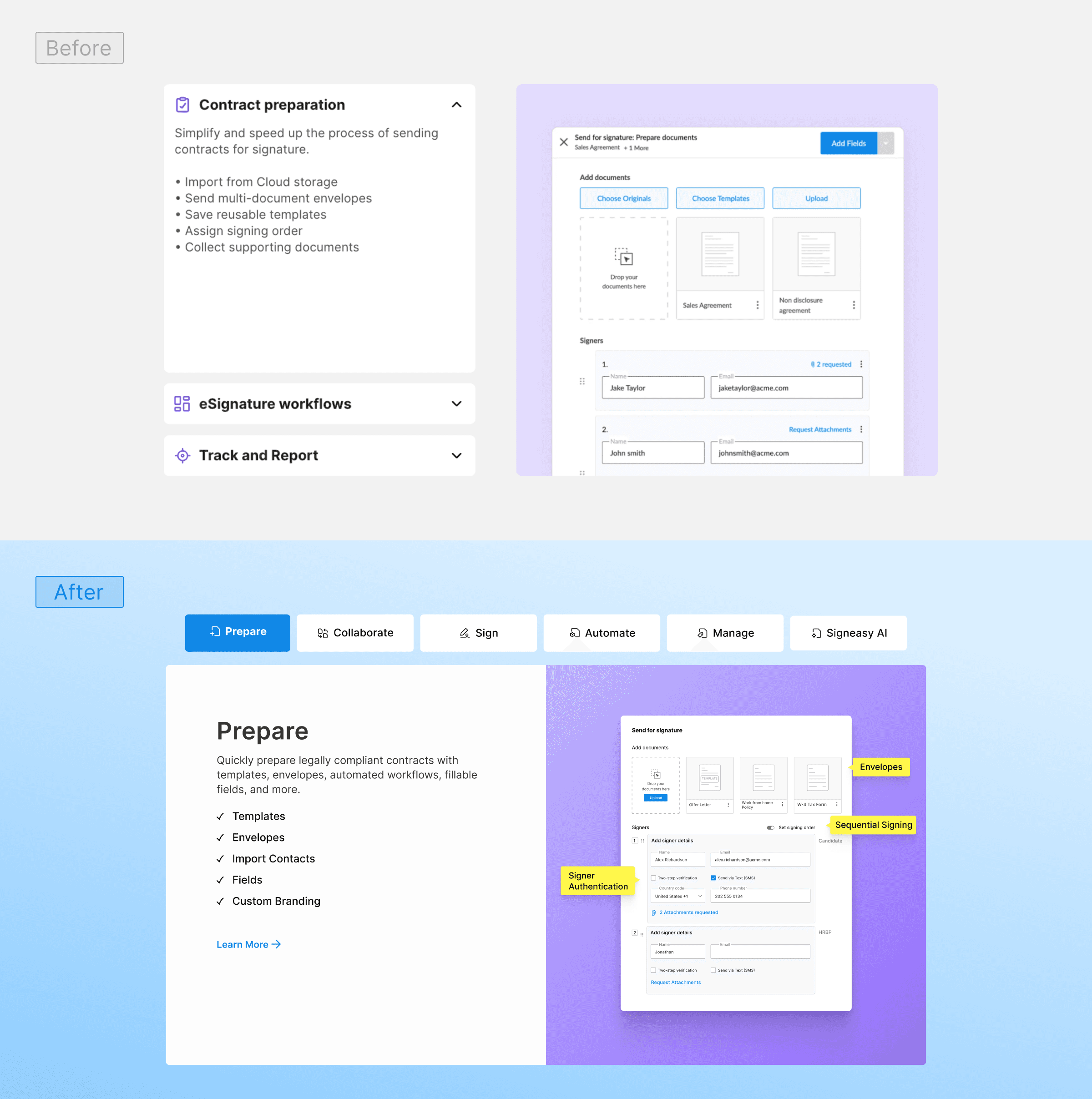
2. Updated Product Offering Section
The product section was redesigned into a clear, journey-based flow with stage-wise navigation. This made the experience easier to scan and understand, guiding users through the product more logically and intuitively.
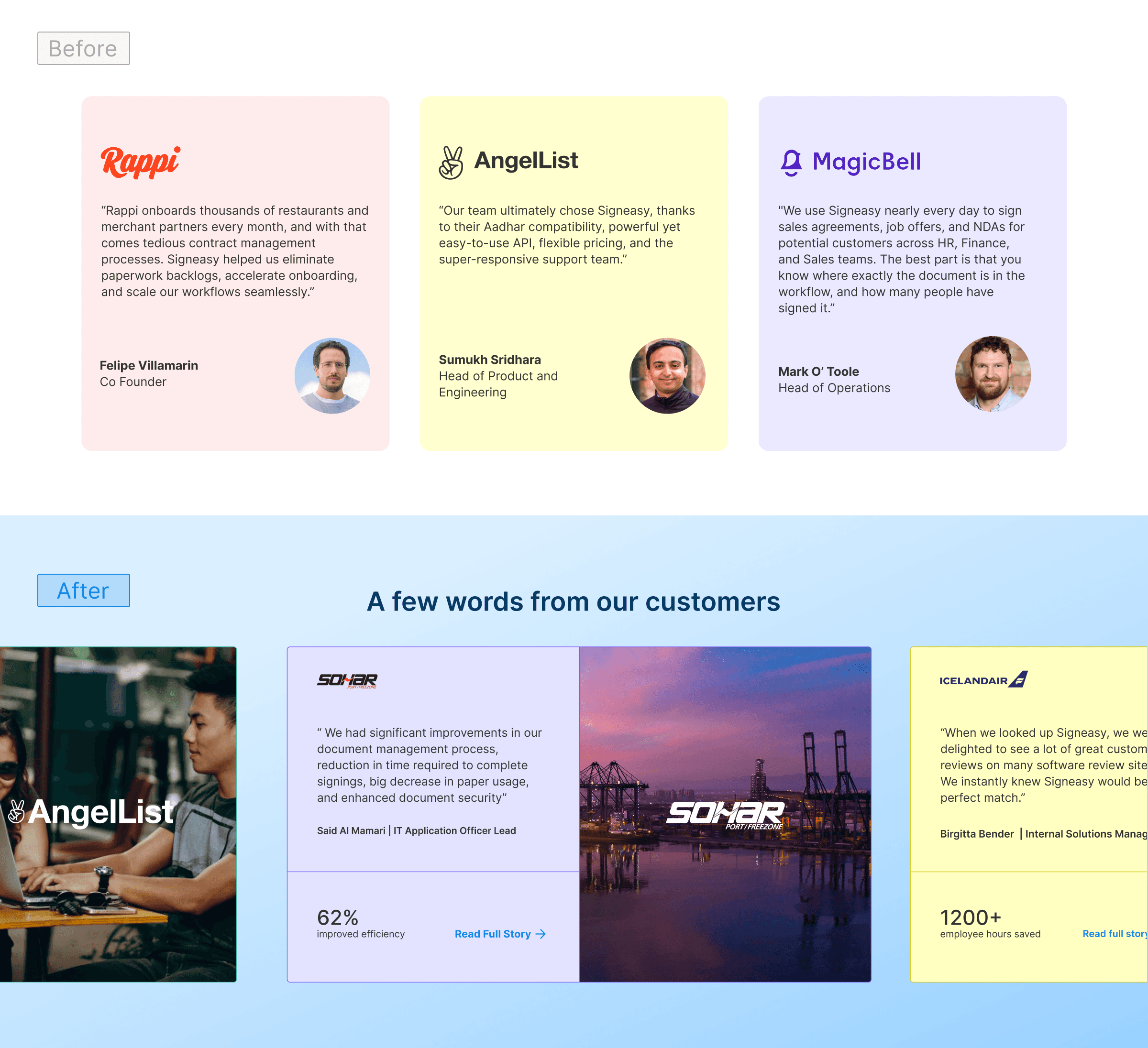
3. Customer Stories & Testimonials
The customer story section was redesigned with a stronger visual focus to highlight the industries Signeasy serves and the real impact of the product. This made success stories more prominent, relatable, and engaging, encouraging greater user interaction.
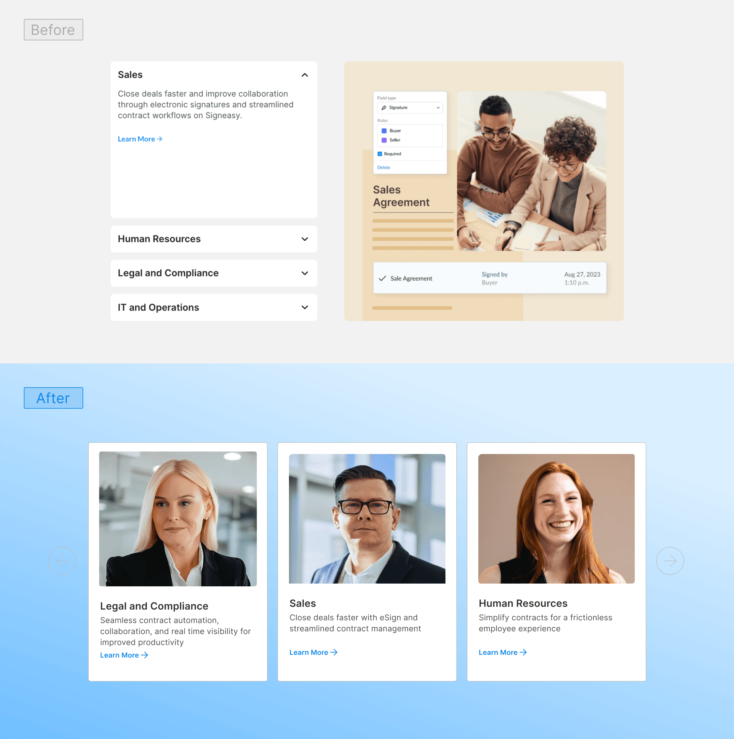
4. Department-Specific Content
Scroll depth on the homepage was reduced to surface key content faster and improve engagement. The department section was updated with ICP-specific visuals to create stronger relevance for different user segments
5. Social Proof & Badges
Refined the visual hierarchy to clearly highlight trust badges and ratings from platforms like G2 and Capterra, ensuring credibility stands out without overwhelming the rest of the content.
To validate the redesign, we conducted A/B testing with an 80/20 traffic split between the new and original homepage designs.
Key Impact:
140% increase in conversion rate, with the new design clearly outperforming the older version.
Higher early engagement, as 75% of users interacted in the first section, reducing early drop-offs.
Better visibility of value, trust signals, and CTAs by reducing scroll depth and surfacing key content earlier.
See Complete Website
see also


